Sneak peek at the process of crafting a dynamic web tool for The Tomorrow Plan
Ever wonder what goes into building an interactive engagement tool for planning? The secret is that it’s really, really fun. Here’s a peek into our process of creating Design My DSM, a brand-new dynamic tool for The Tomorrow Plan.
We’ve been working with a team of creative researchers, graphic and interaction designers, and web developers to build a tool specially for The Tomorrow Plan. Here’s a breakdown of the steps, which start with sketches scrawled on scraps of paper and progress through detailed content research, user experience design, and web development.
Brainstorming the Big Ideas

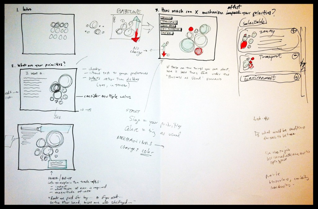
We started with three big ideas:
- Most planning tools let you look at some pre-made maps or research material. How could we design a fun interface that is all about you, how planning impacts you, and what you want to see in the future?
- Getting people engaged and excited about the planning process can be hard. Why don’t we design a tool that is playful, focused on education, and designed to elevate the discussion of ideas?
- Crowdsourcing and participatory planning techniques are the next frontier for planning. What if we used the dynamic tool to directly feed your input into a brand new scenario?
At Sasaki, we’ve developed many different types of dynamic tools, and the common theme is that all are designed to help decision-making. Our goal is to make engagement tools that can have a positive impact on public discourse. And the best way we know how to do that is to make it personal, and make it fun. So, what did that process look like?
Concept Development and Interaction Design
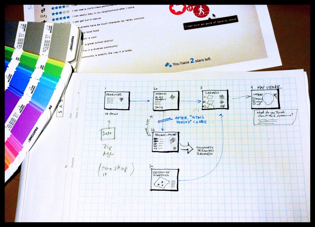
The original brainstorming sessions were all about getting good ideas in place with pen and paper. Then, the next step was to start illustrating those ideas, sharing the concept mock-ups to get feedback, and testing the dynamic media options.
We decided to use a fun JavaScript element that would dynamically change the size of circles to illustrate differences in how users ranked their priorities. This formed the base element for the rest of the Design My DSM game.
Prototyping, Illustrations, and Screen Mockups
One big project was to design icons for all of the different priorities bubbles (the previously mentioned circles). This image shows some of the early designs for many different priority ideas.
![]()
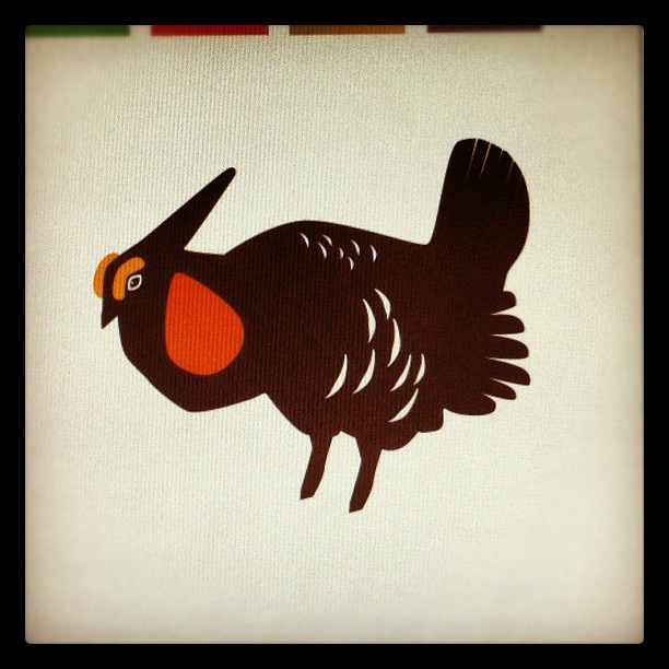
Some of the early drawings didn’t make the final cut, but all of them were interesting to illustrate. My personal favorite was an illustration of a Prairie Chicken – they are such beautiful birds! – but it didn’t make the final editing cut. Too bad!
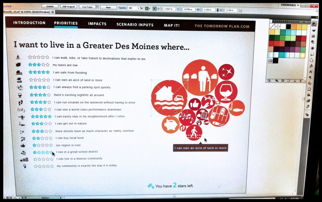
Next up was to design the user interaction and refine the mockups for the different screens of the Design My DSM tool.
This step was a huge creative leap forward in the process because this was the first time those messy pen sketches grew into more elegant renderings. These mockups were invaluable tools for discussion with The Tomorrow Plan committees, since it’s always easier to react to something when you can start to see what it might look like.
Research, and more research
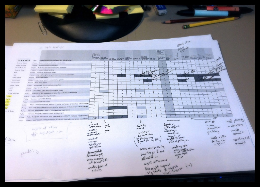
So if you take a list of about 15 priorities, and then a list of 20-something projects and policies, and you ask how each project or policy impacts each priority, what do you get? A lot of research. And a really hefty matrix of ratings. These numeric ratings drive how each bubble’s color changes per each impact. Also, each bubble is accompanied by explanations for why exactly each project or policy might have a positive, neutral, or negative impact on that priority.
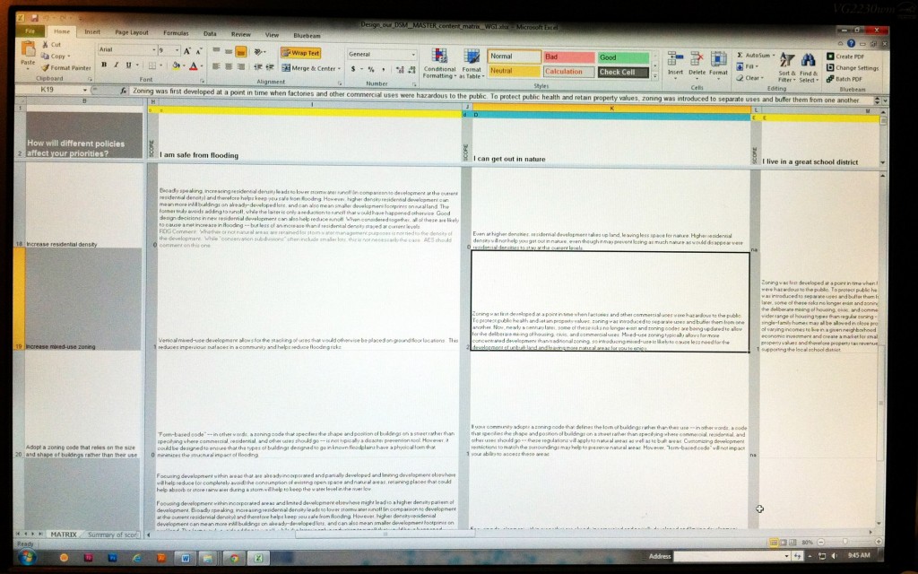
Our team has had some lively discussions about how to rate and explain each impact. Each part of our team weighed in with different perspectives – economics, ecology, transportation, placemaking, and local planning – and The Tomorrow Plan working group added their ideas as well.
In many cases, it is hard to say with certainty what impact a policy or regulation will have on a place. But that uncertainty and complexity of intertwined systems is one of the big ideas behind this tool: planning for 40 years into the future is not a certain thing.
There are significant trade-offs between economic, social, and environmental goals, and each planning decision has many impacts on the different facets of sustainability. Some of these impacts are obvious and some are subtle; some of them occur immediately and some only appear decades later; some only show up when they are happening in tandem with several other conditions. The Design My DSM game is designed to reveal that complexity and to make that tension between different priorities, policies, and trade-offs an accessible—and interesting—part of the discussion.
Review and Revisions
Today, we’re about two weeks shy of launching the tool. User testing starts next week. Right now, we are wrapping up the content development—now circulating around the team for those last eagle-eyed comments—and the design team is working closely with the web development team to bring the visual ideas together with the technical back end.
We are really excited to be pushing in a new direction for planning engagement, and I am happy to say this has been a really fun thing to dream up and then turn into reality. We are looking forward to sharing the final tool with you soon. I hope you’ve enjoyed a sneak peek behind the scenes.
Stay tuned for the launch of the Design My DSM game in a few weeks.
 Sarah Madden is an urban planner and graphic designer on The Tomorrow Team, and the Planning Sustainability Coordinator at Sasaki. She loves a good creative challenge that blends planning ideas, visual design, and dynamic media. She’s also looking forward to a springtime birdwatching trip in Iowa.




Please keep in mind that some of us rural residents still don’t have good Internet access, and some of us only have what amounts to dialup access, even near towns like Ames. When the wind blows hard, I’m essentially off-line. If you want rural opinions, please make sure there are ways for us to participate that don’t require broadband. Thank you.
Pingback: Designing my Design My DSM Data | The Tomorrow Plan